Logo history
Today
The INFUSE logo, consisting of black uppercase letters and three blue stripes, is the core element of our brand identity, encapsulating our mission, vision, and values. It is both readable and easily identifiable.
Safe zone
Maintaining sufficient clear space around the logo is essential for legibility, ensuring it stands out from surrounding elements and is easily legible and identifiable. For this, utilize the dimensions of the letter U from the logo as a reference:
Corner radius
The corner radius of the plate increases proportionally with the plate and the logo
Minimum Contrast
Applications over darker backgrounds may render the logo illegible. When placing the logo over a background with a contrast ratio of more than 30%, please insert it in a white box featuring our signature 56° slant, as directed below.
These rules apply to all media, be it print or digital, both for promotional and internal use.
The white box recommended in these instructions is included in the logo pack (‘filename.png’).
Use with Pictures


High-contrast backgrounds
For applications over light backgrounds, use the regular INFUSE logo, always in full color.
Low-contrast pictures
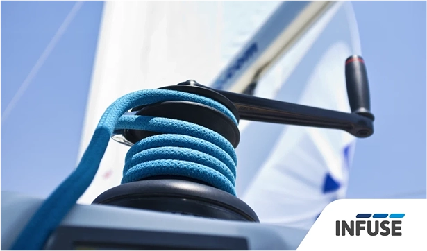
For applications over dark backgrounds, please utilize the white box discussed above.
Logotype Don'ts
❌ Do not scale/stretch disproportionately
❌ Do not use outline-only versions
❌ Do not recolor
❌ Do not apply drop shadows and <br> other effects
❌ Do not change the order of the elements
❌ Do not discolor or use negative <br> versions
❌ Do not tilt or angle
❌ Do not remove any elements
Special cases
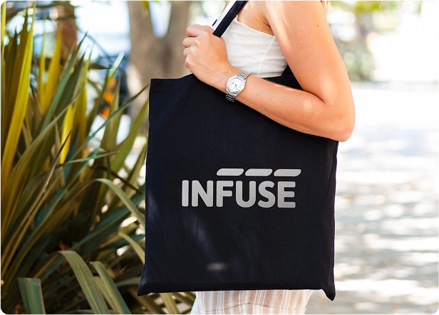
The monochrome version of the logo is used in rare cases when it is not possible to apply the coloured version: blind embossing, stamping, application of Oracal film, etc.
In all other cases, use the basic version.
